Single media section
Embed a full-width video or image on a bold strip of colour.
Single media section example


Why use a single media section component
The single media section displays an image or video full width, making it easy to view an embedded video on the page without going to YouTube. It is useful for important video content that you want to feature prominently.
The single media section should be used sparingly. To minimise scroll depth and maintain a clear hierarchy of content, don't use this component twice on one page. If you need to display more than one video on a page, use the single media content component instead.
Key features
- You can change the background colour (white, purple or teal) through the rendering options in Experience Editor.
How to create a single media section component
- The heading and description fields are optional but can be useful for providing context about the video or image.
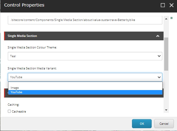
- The component is set to display an image by default. Find out how to display a video.
Image dimensions
If you are using an image, upload the image to the Media Library in the correct dimensions.
|
Image dimensions |
850px by 500px |
Recommended word count
|
Heading |
8-30 characters (with spaces) |
|
Description |
15-30 words |
How to display a video
If you are adding a video, it must be uploaded to the official UWE Bristol YouTube Channel first. Request this via the Social Media Team at socialmedia@uwe.ac.uk.
- Find the YouTube ID, which is the last part of the URL, for example:
Full URL: https://www.youtube.com/watch?v=fnFd3eYhzOk
YouTube ID: fnFd3eYhzOk - In Content Editor, open the single media content component and add the ID into the YouTube ID field.
- Change the component's rendering options from 'Image' to 'YouTube' in Experience Editor.

