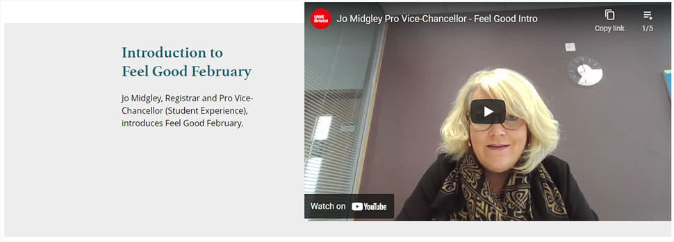
Single media content
Display an image or video next to a block of text.
Single media content example


Why use a single media content component
The single media content component can include an image or a video alongside a text block. The component is slightly inset and has a grey background, helping it to stand out on the page.
This component must include an image or video, a heading and a short description.
If you want the video to appear full width for more visual impact, consider using the single media section component instead.
How to create a single media content component
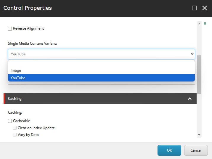
- The component is set to display an image by default. Follow the instructions provided if you want to change it to display a video.
- The image or video can align to the left or right of the text block. This can be changed via the rendering options in Experience Editor.
Image dimensions
If you are using an image, upload the image to the Media Library in the correct dimensions.
|
Image dimensions |
840px by 470px |
Recommended word count
|
Heading |
8-30 characters (including spaces) |
|
Description |
10-60 words |
How to display a video
If you are adding a video, it must be uploaded to the official UWE Bristol YouTube channel first. Request this via the Social Media team at socialmedia@uwe.ac.uk.
- To display a video, you will need the YouTube ID. The ID is the last part of the video's YouTube URL.
Full URL: https://www.youtube.com/watch?v=fnFd3eYhzOk
YouTube ID: fnFd3eYhzOk - Open the single media content component in Content Editor and add the ID into the YouTube ID field.
- Change the component's rendering options from 'Image' to 'YouTube' in Experience Editor.

