Creating components
Creating components in Content Editor
Components can be added in Content Editor using the left-hand menu.
Navigate to the Components folder (below the pages folders) and expand it using the small arrow.
Next, find the folder with the desired component you wish to create and open it. Now you need to duplicate one of the existing components, see details below:
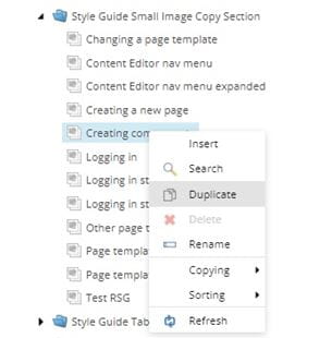
Duplicating components
To create a component it's best to duplicate one of the existing components by right clicking and choosing 'Duplicate'.
There will be the option to 'Insert' as well, but if you choose this option you will need to check all of the settings to make sure the component is set up correctly, so it's faster and easier to duplicate.
There is usually a dummy component within each folder which is the ideal one to duplicate as the fields will be empty and ready for you to fill in.
How to name new components
When naming components please use this style:
accom-apply-after-Acceptinganoffer
Method:
- Refer to the URL for the page. Start the component name with the first five letters of the second level navigation section (eg. 'healt' for 'Get disability support' - not 'Life' as this would be the top level). If there are less than five characters, eg. for 'fees', just use four characters.
- Separate with a hyphen and then add the first five letters of the next level page.
- Repeat previous two steps if there are more levels (ie. a subpage of a subsection)
- Add the component title at the end, using a capital letter at the beginning, and without hyphens between the words. This makes it clear it is the title and not another subcategory. This can be more than five letters. Use a title that reflects the header or the subject of the content, eg. 'Howtoapply'.
- If there is more than one of a specific component on a page then give it a number at the end.
Please note:
- Don’t include the component type because they will be grouped by type in folders.
- Don’t include top-level navigation in the name unless it is for that landing page.
Example:
accom-apply-after-Acceptinganoffer for a component on this page:
https://www.uwe.ac.uk/life/accommodation/applying/after-you-have-applied
Note how the top-level page 'life' is not included in the component name.
Naming shared components
Each component type should have a shared folder that you can save your shared component in. Preface it with the word 'shared'.
If you are creating a shared component to go on the Frenchay, Glenside and City Campus pages, the name would be shared-campu-facil-barscafesshops.
You might need to add shared components within different levels of a section. Eg we needed a promotion bar for all the Awards Ceremonies pages linking to coronavirus guidance. The component was called shared-award-Graduation.
Word limits
|
Component name |
Recommended word count for header |
Recommended word count for body text/description |
|
Manual Block of Cards and Content Carousel |
8-35 characters (with spaces) |
20-35 words |
|
Feature Link |
8-45 characters (with spaces) |
15-40 words |
|
Featured Image |
8-30 characters (with spaces) |
15-30 words |
|
Gallery |
8-40 characters (with spaces) |
0-30 words |
|
Image copy section |
8-45 characters (with spaces) |
100-140 words |
|
Large quote |
N/A |
30-50 words |
|
Multi size hover colour cards |
As short as possible, max 15 characters (with spaces), varies depending on the image |
15-30 words, varies depending on the image used |
|
Overlapping hover cards |
As short as possible, max 15 characters (with spaces) |
10-15 words |
|
Partner logo strip |
8-30 characters (with spaces) |
0-60 words |
|
Single media component |
8-45 characters (with spaces) |
10-60 words |
|
Single media section |
8-30 characters (with spaces) |
10-60 words |
|
Small image copy section |
8-30 characters (with spaces) |
20-60 words |
|
Tabbed content image section |
1-15 characters (with spaces) for each tab heading |
30-175 words |
Tips to remember
There is quite a lot to remember when creating components for the first time.
Check these tips below for some sage advice:
Dos And Don'ts
Here are some simple rules to remember when creating components.
Do
Do check if you need to create extra parts to your component, for example an Accordion will need 'items' adding to it.
Do
Do ask the Web Editors team if you're unsure which component is best to use.
Do
Do make sure you have a correctly sized image uploaded to the Media Library if your component requires an image.
Don't
Don't use too many of the same components on a page. Try to use a variety when possible.
Don't
Don't go over the max word counts for headers and body text or your component won't display correctly on the page, especially in mobile view.
Don't
Don't save your component in the wrong place, it makes it difficult to find again. You may also need to drag and drop it to the correct place within a folder.