Adding components to a page
Adding in components
You will need to first create your component and save it in Content Editor view before adding it to a page.
Next, you will need to open Experience Editor view for the page you are working on before you can add in any components.
Add here symbol
In Experience Editor view you will notice there is a two pronged symbol up on the left of the top menu, by the save and search buttons. You can use this symbol to insert components onto a page.
Click on it and then scroll down the page and look out for the '+ Add here' button. You can then click on the '+Add here' button or the entire greyed out section it sits within to add your component. There will be multiple '+ Add here' buttons to choose from.

Select a rendering
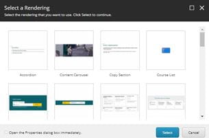
A box will appear once you have clicked the '+ Add here' button which will ask you to 'Select a Rendering'. You now need to select the correct component type from the list and then navigate to the component you want in its folder.
It is worth making a note of the component's name when you create your components for this reason - so you can find them again easily.

Where to place components
You will notice that there are multiple places on a page to add in components, usually in between the in-built copy sections.
You can even add in several components between the in-built copy sections if you wish, one after another.
Think carefully about the priority of content for the user when choosing where to place your component. Usually a page will have some introductory text and then the most important information comes towards the top, for example a Manual Block of Cards with links out to subpages.
If you are adding in a new component to an existing page it may need to sit lower down on the page, depending on how important the other content is.
Moving components around on a page
It's quite straight forwards to move a component up or down on a page, but before you do so please make sure that the content on the page is in a logical and user-friendly order. Speak to the Web Team first if you are unsure about whether to move components up or down. If you're confident the component needs moving then read on below.
The 'Move component' icon
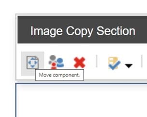
To move a component on a page, first click on the component to select it. A menu will then appear on the top left side of the component. On the left of this menu you will see a small white icon with a page and arrows. If you hover over this icon you will see it is labelled 'Move component'.
Click on the icon and then scroll to the desired location on the page you wish to move the component to. As when inserting a component, there will be the same button as '+ Add here' but it will read '>>Move to here'. Click on the button and wait while Experience Editor loads. Then save your changes.

Choosing display settings
Some components such as the Manual Block of Cards and Single Media Content have different display settings to choose from. If a component doesn't look as you expected in Preview mode, then the first thing to do is try changing the display settings in the component properties, see the instructions below for more information.
Component properties
To view and edit a component's properties, click on the component in Experience Editor view. Then use the top left component menu and choose 'More' then 'Edit component properties'.

Editing the control properties
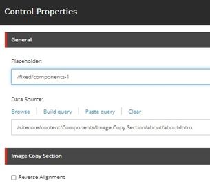
A box will appear with the 'Control Properties' for the component. If the component has different display settings then this is where you will find them. They vary depending on which component type you are using, in this case the component is an Image Copy Section so there is an option for 'Reverse alignment'.

