Curated Tabs
Guidance on using the Curated Tabs Page template.
Curated Tabs overview
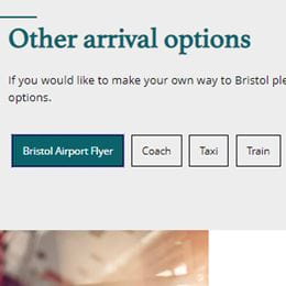
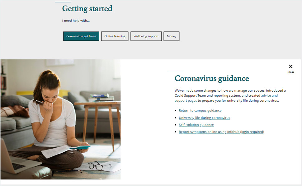
Use this template when you want to display a collection of information or menu of options section on a page and offer users an easy way to choose the item/s relevant to them. By default, all the tab headings are displayed but the tabs themselves are closed so users can choose to individually expand and read tabs they are interested in.
Curated Tabs content is always short and to the point. It's for outlining key details and signposting to further information (if needed).
Avoid using this template if you have long or complicated information.
If you want to use a Curated Tabs Page template, the only way is to create Curated Tabs components that are then pulled through.
Using Curated Tabs

For easy navigation
This template is good for users to access key information at a glance.

Add in extra tabs
You can add more Curated Tabs if you need.

Not suitable for long content
Don't use choose this template if you have long or complicated information that needs a lot of explaining.
Adding Curated Tabs
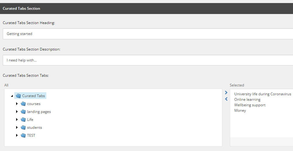
You need to choose the Curated Tabs Page template, and then build a separate Curated Tabs component in the Components library for every tab you want to add.


Pull through tabs
Go to the Curated Tabs Section Heading within Content Editor and open the folder where your tabs sit. Pull them through by highlighting them and pressing the arrow to the right.
You can add a description to your Curated Tabs if you want.

