Curated Tabs
When and how to use Curated Tabs
Curated Tabs work with the Curated Tabs template.
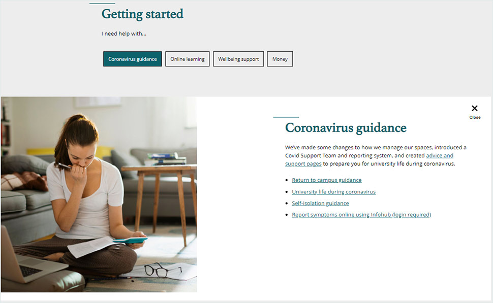
The tabs appear at the top of the page, below the header, allowing the user to select the tab with information that is relevant to them, and browse different sections without leaving this top part of the page.
Curated Tabs content is always short and to the point, so consider shortening text if necessary. Use it for outlining key details and signposting to further information (if needed), not for detailed information.
The tabs include an image, so make sure you have an image ready for each tab and uploaded to the Media Library in the correct dimensions.
With Curated Tabs, you can select up to 12 related cards to be displayed in an optional component below a tab. These should relate to the selected Curated Tab. Eg if the tab is about exams, related cards could be study support pages.
Curated Tabs
You will need to create a Curated Tabs component for every tab you want to add.

Building Curated Tabs
- Navigate to the Curated Tabs component folder. You will need to insert a Curated Tab item for every tab you need.
- Add a heading and short heading (the short heading is for the Curated Tabs button).
- Add an image in the right dimensions.
- Below the image space, there is the usual rich text editor for you to add your copy.
- You then need to make sure that the Curated Tabs are pulled through on the Curated Tabs Page template.

Adding related cards


- You can add related cards by opening the folder that they sit in, highlighting the page you want and pressing the arrow to the right. The cards will display in a carousel.
- You can remove related cards by highlighting the card under the 'Selected' column and pressing the arrow to the left.