Opinion: Stats, leaflets, and claims - how to navigate the political battlefield


Dr Thom Oliver, a senior lecturer in politics at UWE Bristol, sifts through the barrage of leaflets and offers his thoughts on how to discern the truth amongst the claims.
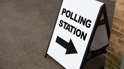
As political leaflets begin to clog the hallways of apartment buildings and fill the green recycling boxes of homes across Bristol, it’s no surprise that debates and disputes over their claims are intensifying among political activists. Returning home to find your usual mix of bills, gutter cleaning flyers, and takeaway menus now includes a flood of political leaflets signals an election is truly upon us. For those in hotly contested areas, the sheer volume of paper can be overwhelming.
The political leaflet is a time-honoured tool in campaigning, aiming to introduce local candidates, outline reasons to vote for them, and often, emphasise who purportedly stands no chance of winning. The familiar slogans like ‘Can’t Win Here’ and ‘Two Horse Race’ are commonplace, reflecting the binary deficiency of the First Past the Post electoral system, which rewards only one winner. Typically, in most constituencies, one party or another is better positioned to challenge the incumbent MP, depending on voter sentiment.
Political parties often gain traction when they present themselves as the primary challenger, but the crux of the issue is that only about a third of voters can accurately predict who the real contender is in their area. Therefore, parties must create a compelling narrative to convince voters that they alone can unseat the current MP. That’s where the contestation begins, featuring bar charts, statistics, and often outdated clipart.
But how might voters discern the truth amidst these claims?
Evaluating political claims: a voter's guide
- Firstly, look at the designs: Be wary of unlabelled bar charts, disproportionate graphics, and missing numbers. These make mathematicians wince and can be red flags indicating an attempt to exaggerate or downplay comparative percentages.
- Next up, what’s the data they are using. Well hopefully the politicians will tell you by the label they put on their bar chart. Examine the data's origin. If a leaflet uses old election results, consider the implications. People, parties, and opinions evolve over time, reducing the predictive power of outdated data. Additionally, parties often showcase results from elections that portray them in the best light, even if those results are from different levels of government or past boundary configurations (at this election over 90% of constituencies are not made up of the same geographic areas).
- Which elections are they depicting? Local election results are frequently used due to their recency but remember that voting behaviour can differ significantly between local and general elections.
- What polling are they using? With the rise of tactical voting sites and social media advice, it’s essential to scrutinize the data backing these claims. While major polling companies adhere to standards set by the British Polling Council, opinion polls are not infallible and operate within margins of error. Misuse or misinterpretation of polling data in leaflets is common, and parties may even use their canvassing ‘data’, which is far less reliable.
What is MRP Polling?
This election cycle has seen limited constituency-level polling, so many predictions rely on MRP (Multilevel Regression and Poststratification) modelling. Here’s how it works:
- National Polling: A national poll collects responses, focusing on demographic factors and geographic elements.
- Demographic Adjustment: The poll results are adjusted to reflect the demographics of each constituency, using census data to predict overall voting behaviour
- Population Segmentation: The population is divided into small groups (strata) based on characteristics like age, place, and employment status.
- Aggregation: Predictions for these groups are combined to estimate the overall vote for the constituency.
While MRP is a sophisticated method, it’s not foolproof, especially in areas with significant tactical voting, which defies historical voting patterns. Take it with appropriate pinches of salt and look for other examples of political activity (poster boards, canvassers knocking on doors, targeted social media adverts) to explore whether political parties think it is worth chasing your precious vote.
Final thoughts
As you sift through the barrage of political leaflets, remember that statistics can be blunt instruments. Prioritise recent results from relevant geographies, scrutinise the origins of data, and check for missing information. And most importantly, keep in mind that the only poll that truly matters is the one with your special voting pencil on election day.

Dr Thom Oliver is a Senior Lecturer in Politics at the University of the West of England, Bristol. He is leading the Qualitative Election Study of Britain 2024, which is currently recruiting participants from Bristol to take part in Focus Groups about the election.
Related news

17 December 2025
Findings revealed from first UK study into experiences of mothers who are survivors of rape pregnancy
UWE Bristol academics have revealed the findings of the first UK-based study of the experiences of mothers who are survivors of rape pregnancy.
07 October 2025
Academic playing role in project to find hidden graves in Mexico using drone technology
A UWE Bristol lecturer is playing a part in a project using drone technology to locate concealed graves in Mexico.

16 September 2025
Dedicated liaison roles ‘instrumental’ for police forces to build trust with sex workers, research finds
A new study from UWE Bristol researchers has found that a dedicated liaison officer could help rebuild trust between the police and sex workers.

11 September 2025
New study to investigate augmented reality as an intervention for emotionally based school avoidance
A UWE Bristol researcher will support a new study exploring whether an augmented reality board game can help young people with emotionally based school avoidance (EBSA).

22 July 2025
Angellica Bell receives honorary doctorate from UWE Bristol
Angellica Bell, a prominent figure on British television and radio, has been awarded an honorary degree by UWE Bristol.

17 July 2025
Want social change? A deeper understanding could be key, study suggests
New study suggests a deeper understanding of social change could help close the gap between challenges and actions, especially on issues like climate change.

16 July 2025
Researchers launch support hub for people with visible differences and their families
A first of its kind website offering evidence-based psychological support for people with visible differences and their families has been launched by university researchers.

27 June 2025
UWE Bristol and Avon and Somerset Police renew partnership to advance police education
UWE Bristol and Avon and Somerset Police have signed a new 10-year agreement, extending their successful partnership to deliver high-quality, forward-thinking police education and training.
25 April 2025
Opinion: ‘Where is the vision in the WECA mayoral race?’
Dr Thom Oliver, senior lecturer in politics, gives his expert opinion as voters prepare to head to the polls to elect a new WECA mayor on 1 May.
16 April 2025
UWE Bristol academic paper named as one of this century’s most-cited
A UWE Bristol academic has co-authored the third most-cited academic paper of this century, according to new analysis released by research journal Nature.

30 January 2025
Women exercising in gyms face barriers including body image and harassment, study finds
Women exercising in gyms often feel judged for their appearance and performance, leading to a persistent sense of inadequacy, according to a new study.
17 December 2024
‘One of a kind’ course accredited by UWE Bristol recognised with Princess Royal Training Award
A foundation degree accredited by UWE Bristol has been awarded a prestigious City & Guilds Princess Royal Training Award.
You may also be interested in

Media enquiries
Enquiries related to news releases and press and contacts for the media team.

Find an expert
Media contacts are invited to check out the vast range of subjects where UWE Bristol can offer up expert commentary.